03 · A STRUCTURED LEARNING SYSTEM
Cambly Classroom
Cambly needed a way to deliver consistent teaching quality across thousands of tutors worldwide. I designed Classroom, a structured curriculum and toolset used during live sessions, as the first designer on the team.
- Increase in registered users +33%
- Tutoring sessions per day 60,000+
- Active tutors globally 6,000+
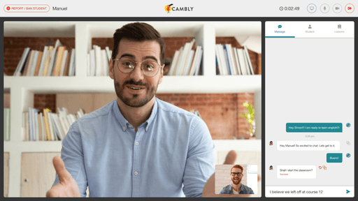
Cambly needed a way to deliver consistent teaching quality across thousands of tutors. Students were jumping between different teaching styles, progression was unpredictable, and new tutors struggled without a shared framework. Cambly Classroom introduced a structured curriculum and toolset used during live sessions, so students kept their place between tutors, and tutors had something to teach from.
As the first designer at Cambly, I owned the work end-to-end, from the research that defined the system to the prototypes that shipped.
The problem
Teaching standards
Cambly’s tutoring experience lacked consistency. Tutors used different methods, students bounced between styles, and popular tutors became overloaded while new tutors struggled. Without a shared curriculum or progression model, Cambly couldn’t scale or guarantee quality.

The approach
As the first designer at Cambly, I needed a fast, accurate understanding of how live tutoring worked in practice. I partnered with our PM, who had years of education expertise, and conducted interviews with tutors to understand their day-to-day challenges. I also reviewed the existing product end to end to map where teaching inconsistency appeared and why tutors struggled to standardize lessons.
Competitive analysis helped me see how other platforms handled curriculum and assessment. The direction came together: build a system that supported real teaching and gave students a sense of progress that survived between tutors.
The discovery
Personalized learning success
Interviews and product audits revealed that most tutors were improvising their lesson plans. They had no shared baseline for evaluating student skill levels, which made the first session inefficient and created inconsistent progression between tutors. Students described feeling “reset” every time they switched tutors.
These patterns clarified a key requirement. The classroom needed a shared structure flexible enough for different teaching styles, but stable enough that progress carried across whichever tutor a student matched with.
Competitive analysis helped identify gaps and define a scalable interaction model. From this I created design principles to guide the system.
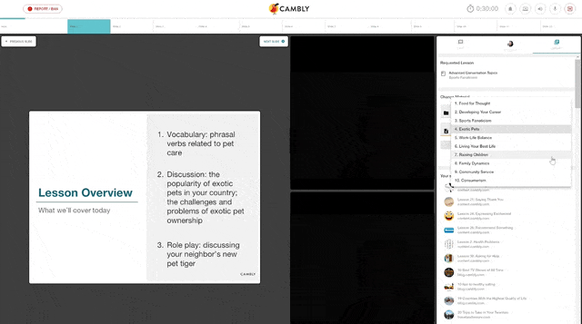
The framework
- Progression over Quick Wins.
Foster an environment of continuous learning rather than one-off memories.
- Collaborative over Individual.
Promote collaboration and interaction between tutors and students over individual learning.
- Empowerment over Automation.
Equip tutors with tools that provide insights into each student’s challenges, rather than a rigid one-size-fits-all approach.
- Continuity over Improvisation.
Anchor every session in a shared structure so progress survives across tutors.
Constraints
Technical constraints shaped many early decisions. Tutors often taught from low-resolution laptops and Chromebooks, while students used higher-quality 16:9 displays. Existing course assets were 4:3 images, so the layout had to adapt across mismatched aspect ratios without sacrificing readability or hierarchy.
These constraints forced me to prioritize clarity and teachability over visual density. They also influenced our decision to optimize for students first and scale down for tutors, instead of building tutor-first and adjusting upward.

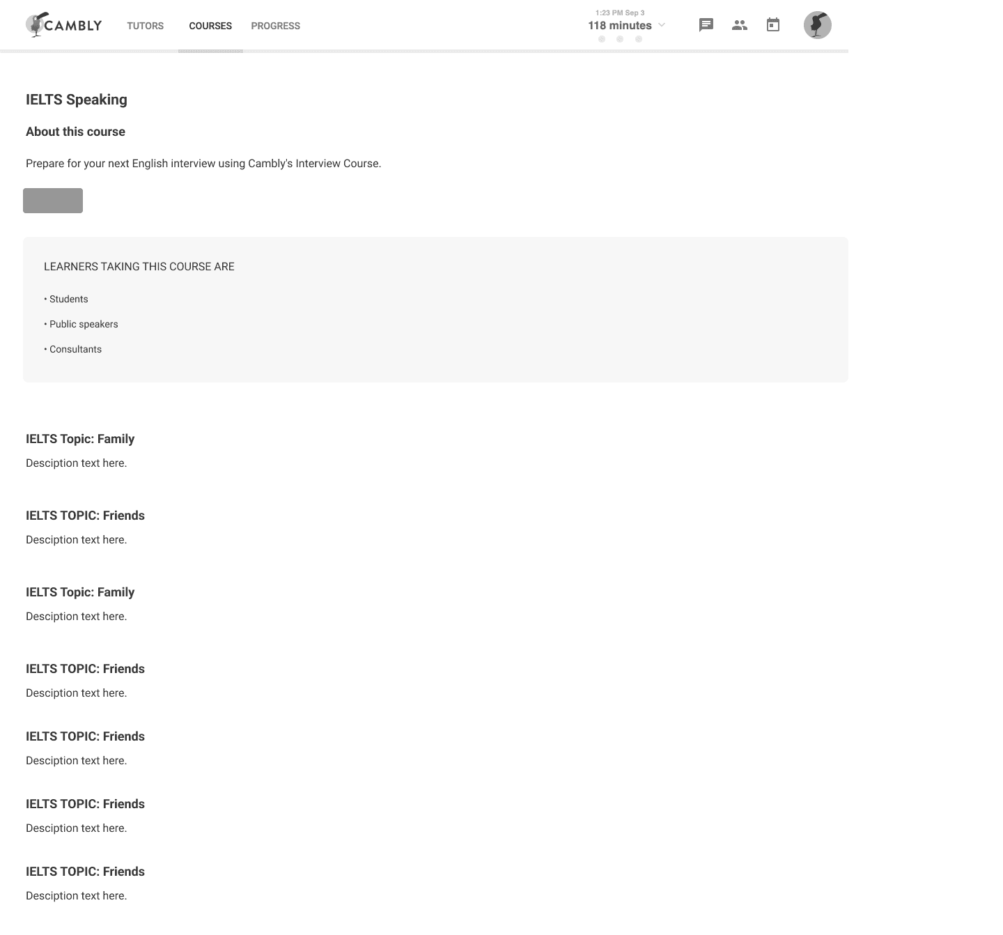
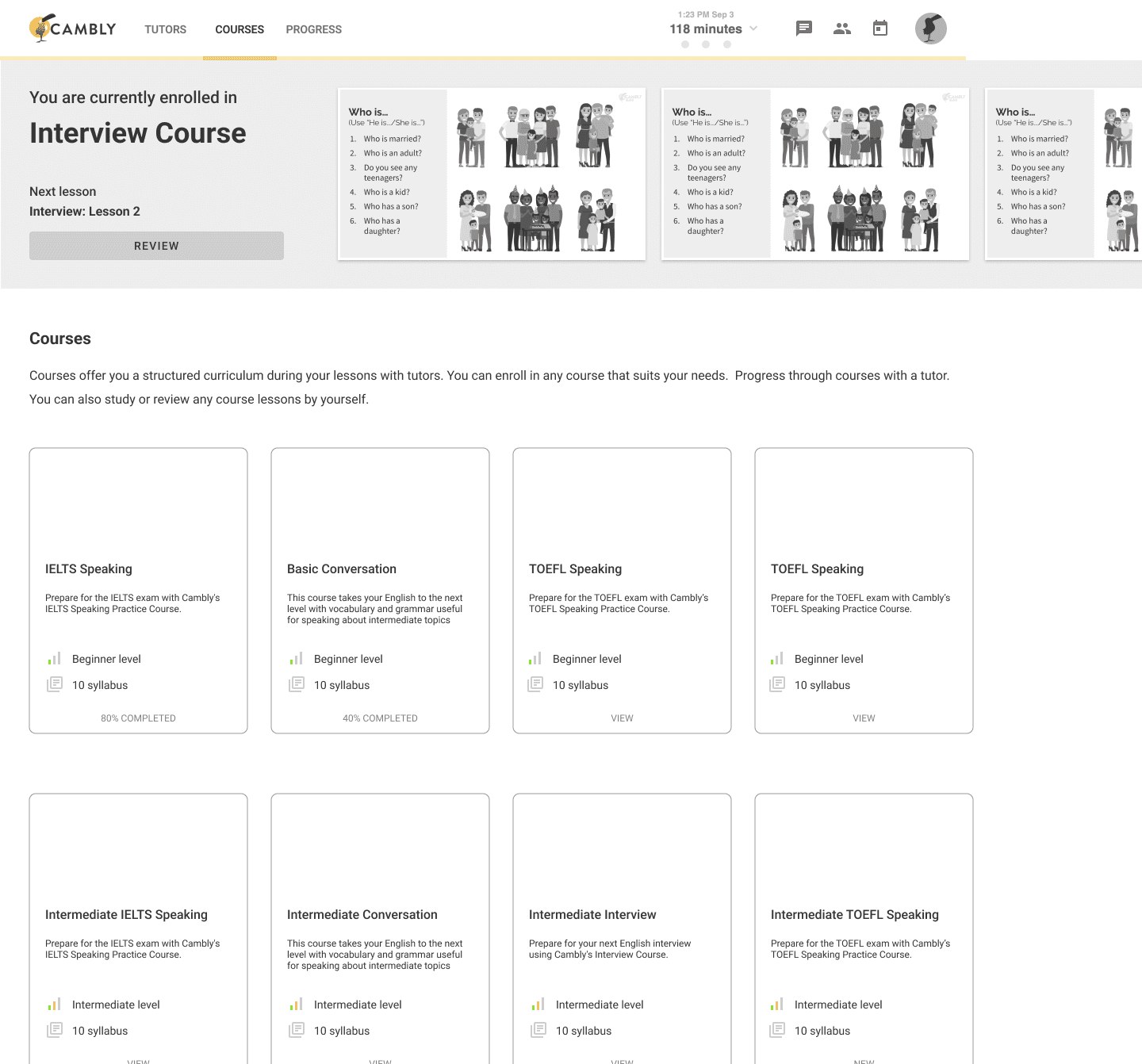
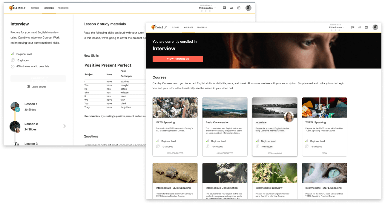
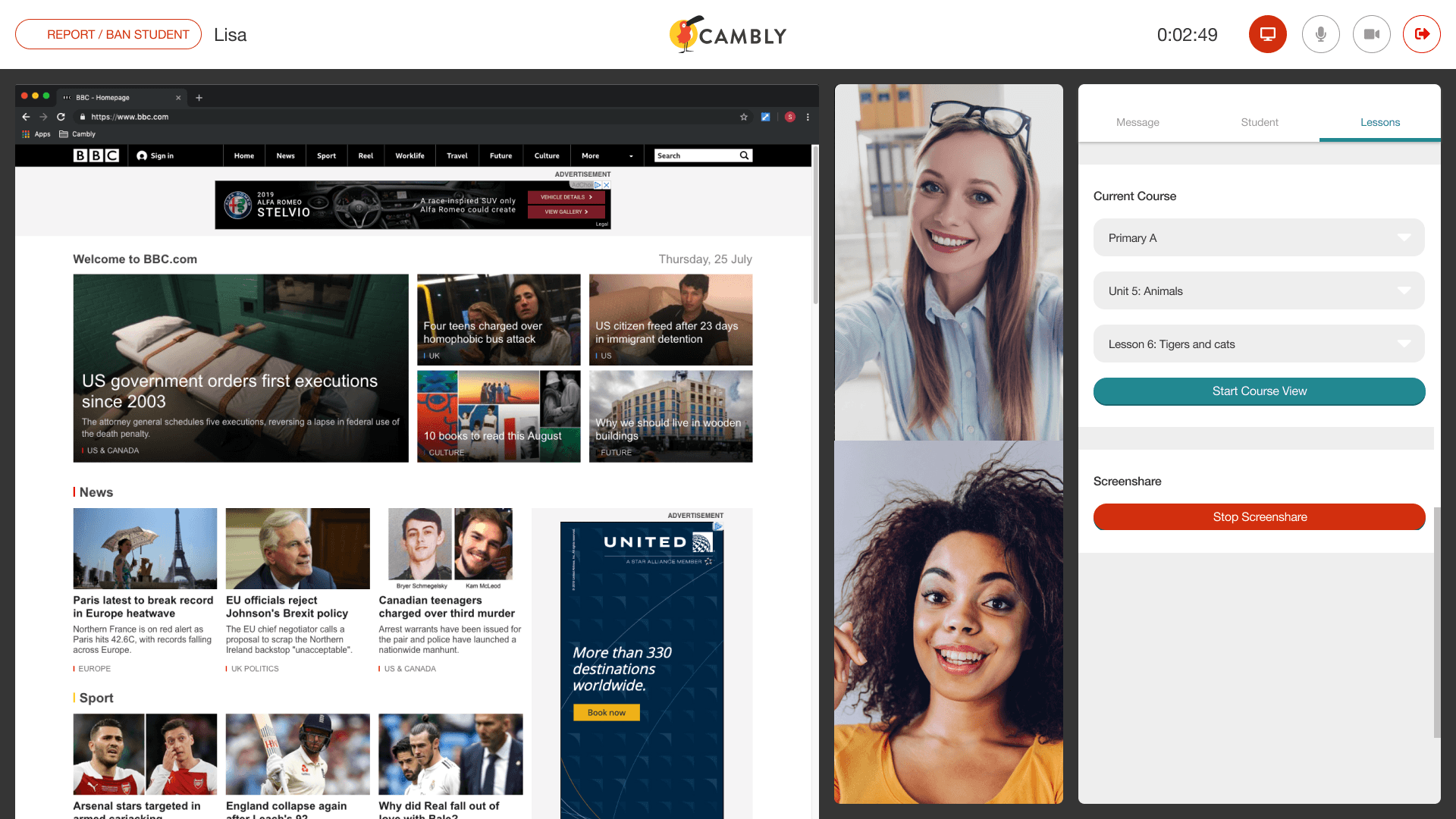
Curriculum and courses
The legacy system wasn’t designed for scaled teaching, so building a fully customized interface wasn’t feasible within our timeline. I leaned on Material Design patterns to establish predictable behaviors and hierarchy while focusing on scalability. The system had to absorb new courses, levels, and media as the content grew.
The goal was to create a structure that tutors could rely on session to session, while giving students a clear sense of progression. This informed decisions around list patterns, section hierarchy, and how lessons surfaced during a call.
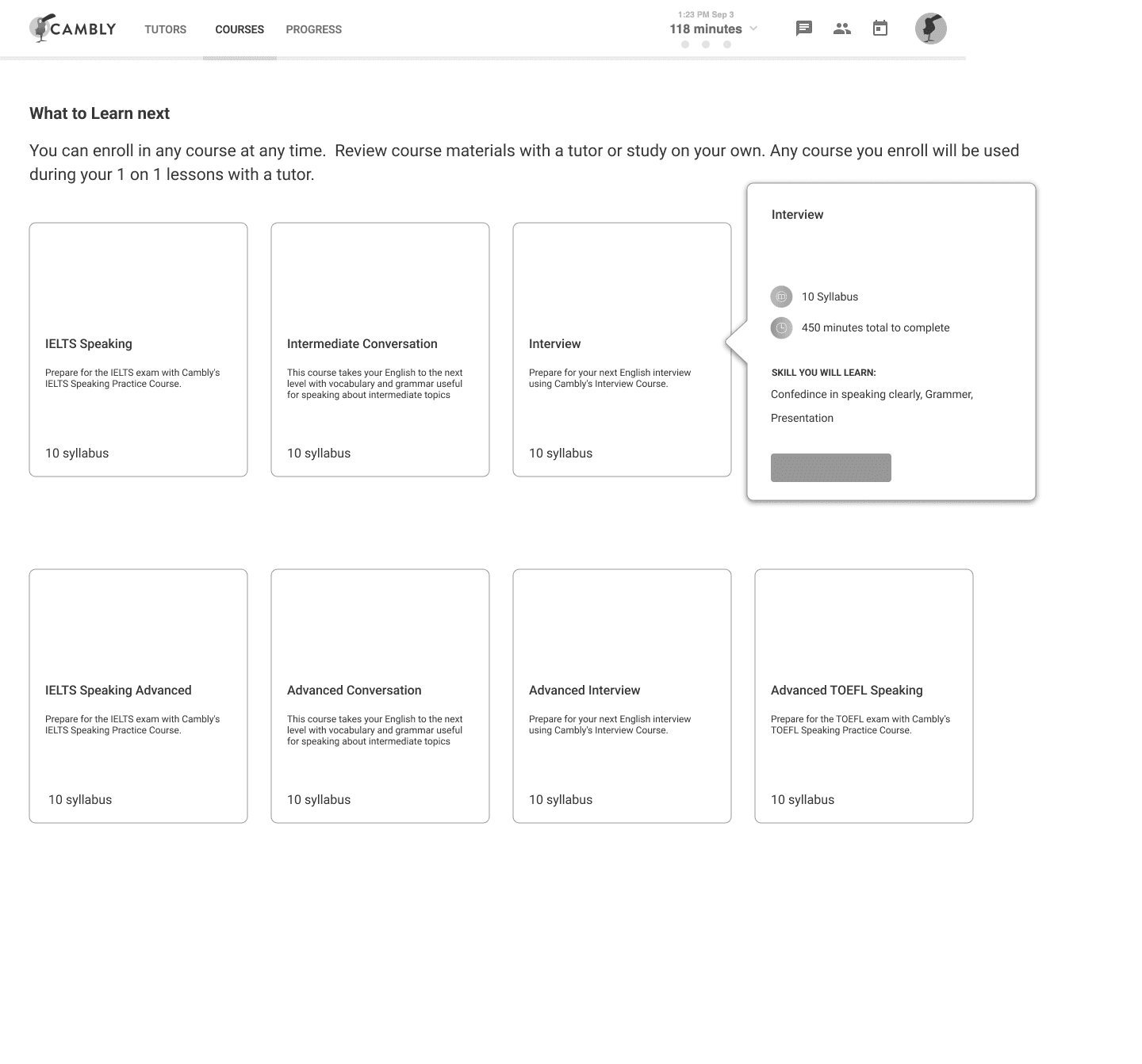
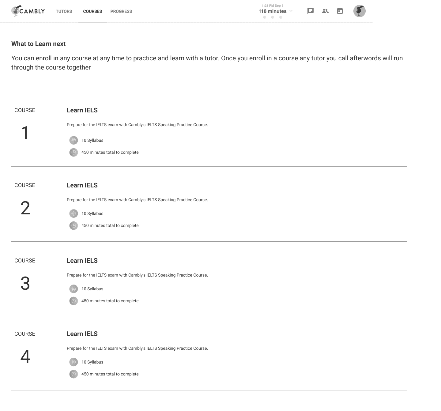
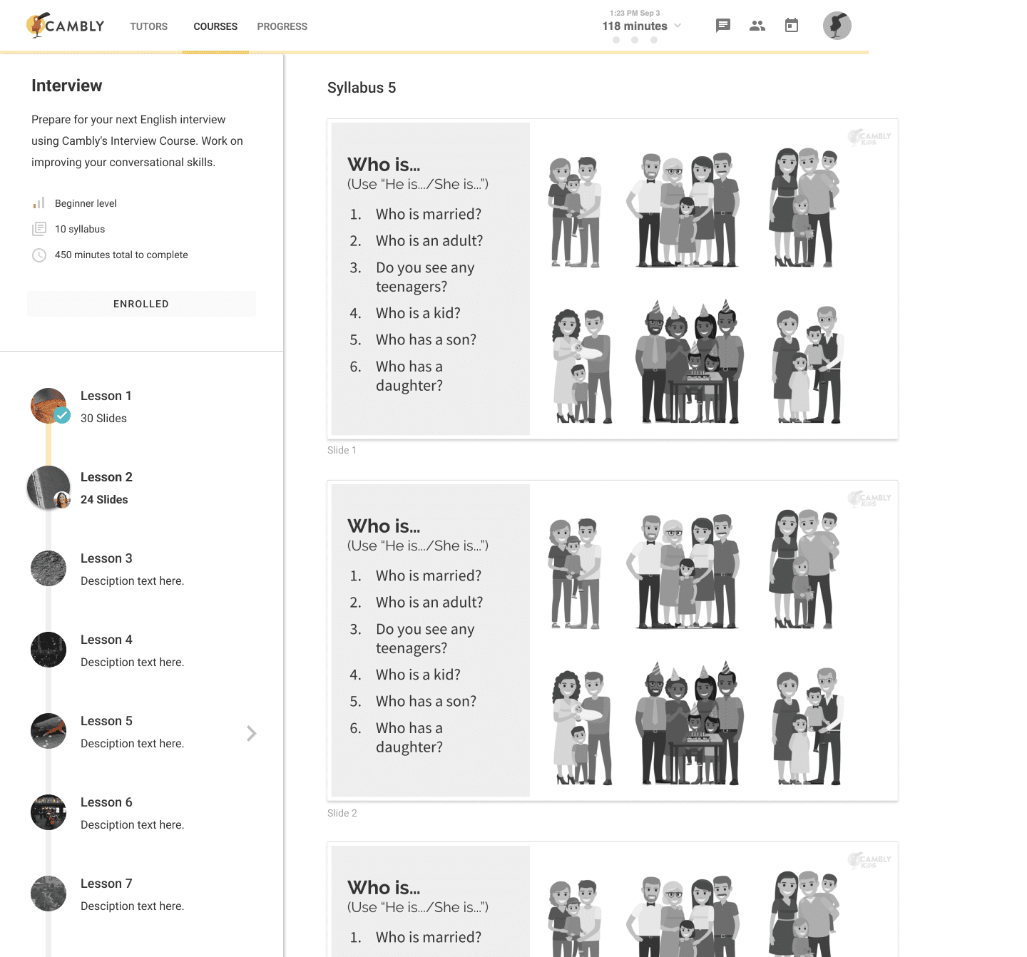
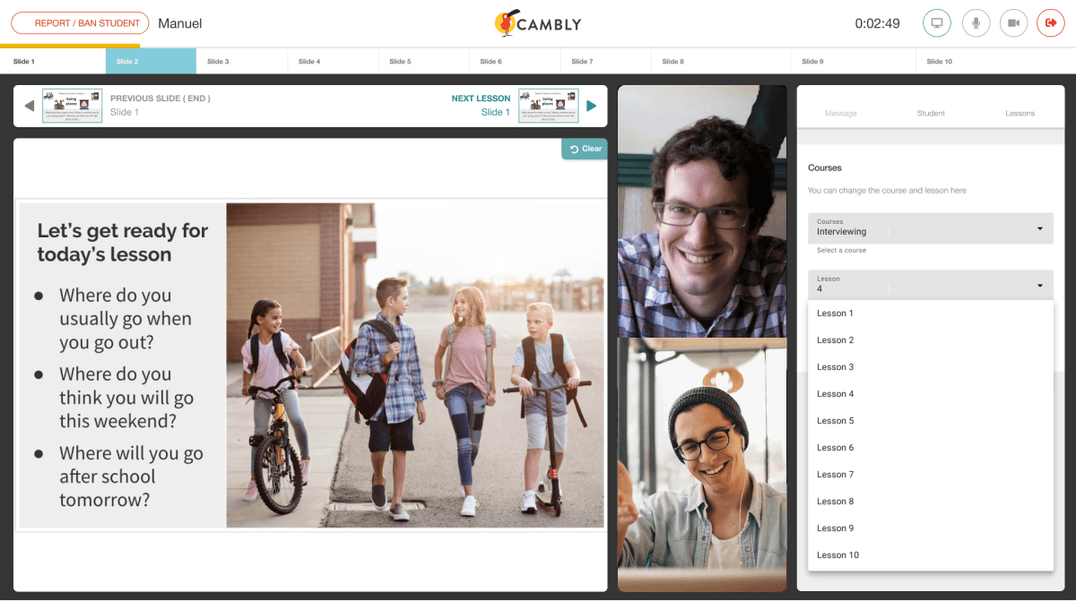
Learn at your own pace
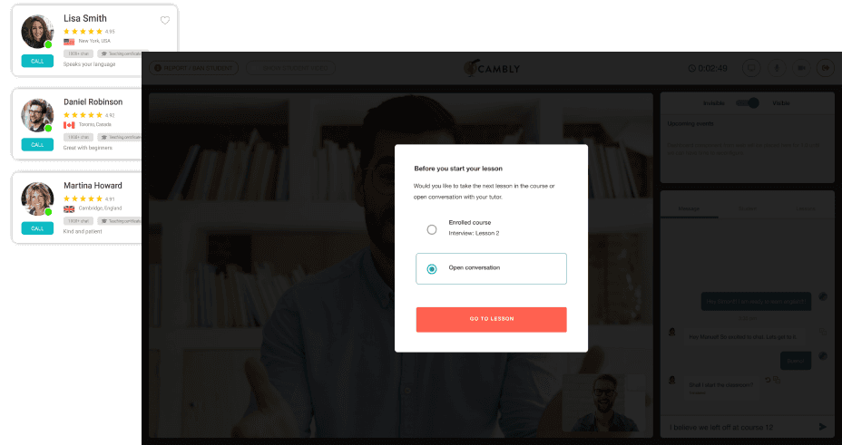
A key failure in the old experience was that students had no influence on what they practiced from tutor to tutor. Allowing students to select lessons before a call created continuity and gave them ownership. Letting them change layouts mid-call disrupted teaching flow, so we restricted layout changes during live sessions.
This balance, student agency before the session and tutor control during the session, became a core part of the system.
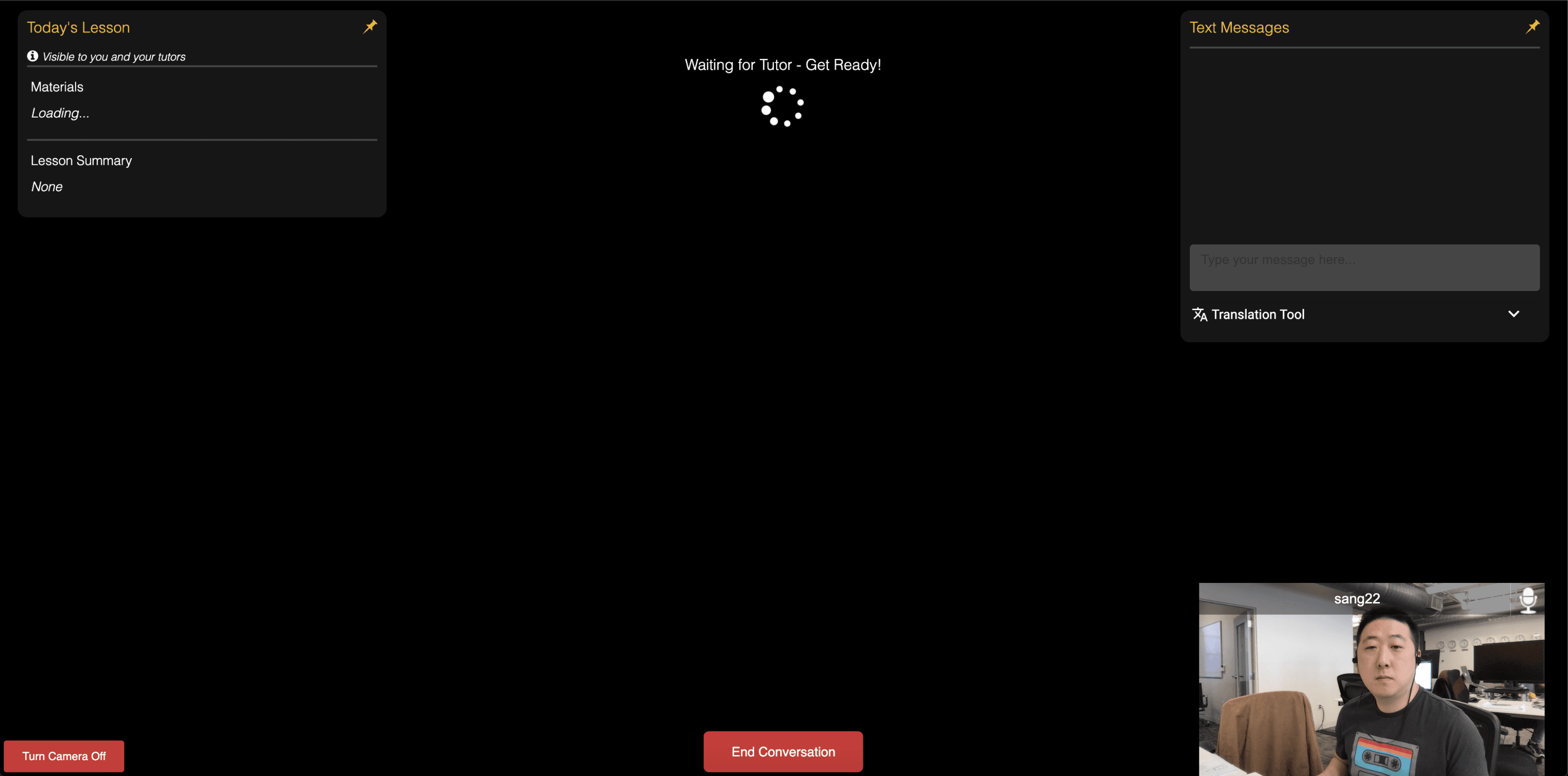
Prototyping and development
We had a fixed deadline tied to engineering milestones, so the process required tight collaboration. I tested development builds daily, identified UX issues caused by Vonage API limitations, and adjusted flows to match what was technically achievable. This iterative loop let us refine interactions and timing in step with engineering, not in front of it.
Left: Early components added 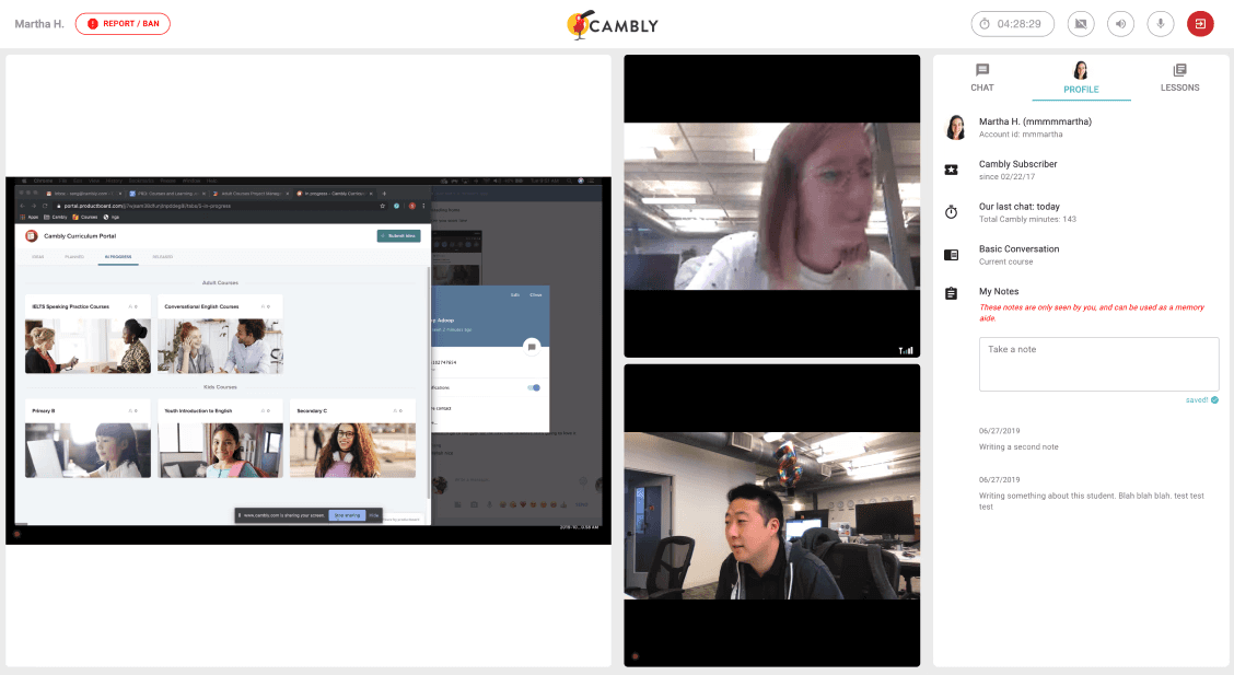
Right: Layout improvements
Live testing
We ran A/B tests with both new and experienced tutors. Call recordings showed how tutors navigated the classroom, where attention dropped, and where content wasn’t surfacing as intended. These insights helped us pace lessons better and surface the right content at the right moment.
The execution
The impact
We launched in 2019. Engagement climbed, session volume grew, and active tutors scaled past 6,000. Metrics are summarized at the top of this case study.
This is a great addition and something I’ve been wanting since I started! I’m glad they introduced the new classroom! - Tutor, Cambly Facebook group
What I like about Cambly is that all the tutors are native English speakers and their high teaching quality. My English has improved a lot and I am having fun studying it! - Student, Cambly
Project learnings
Being the first designer meant I owned the system and the artifacts. The deepest lesson: design where the friction lives, not where the spec points. The pre-session moment turned out to be more important than the in-session UI. Students who picked their own lesson came in oriented, and that orientation cascaded through the rest of the call.